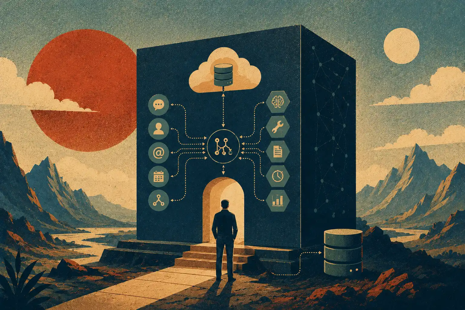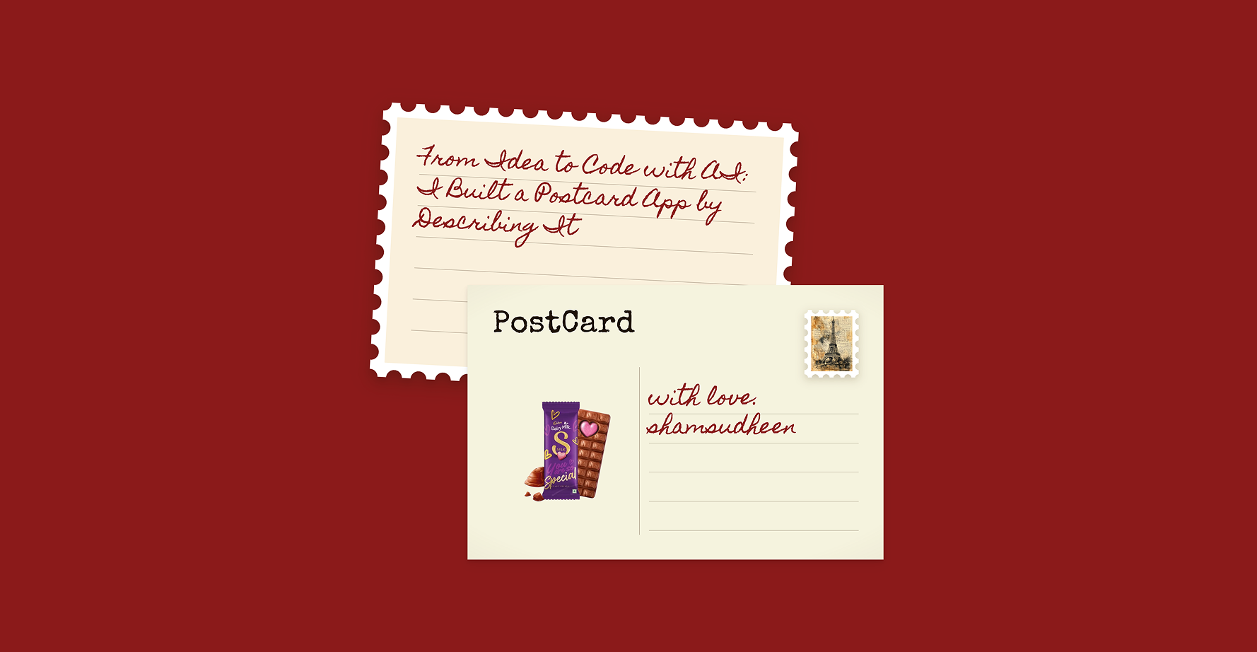

As a designer, I got the best results from Claude Code by doing the product thinking first. I wrote the story, sketched on paper, and treated Figma as the spec. Then I built one piece at a time and fixed visual bugs by pasting screenshots instead of describing them.
A practical process for turning a vague idea into a real product from thinking and notebook scribbles to Figma, Claude, iteration, and launch. Shown through a real project, including the mistakes and the parts AI got wrong.
Most “I built this with AI” stories begin with a prompt and end with a working product.
But that skips the most important part.
Before AI could write any useful code, I had to understand what I wanted to build. I had to take a feeling, explore it, reject ideas, make decisions, and turn it into something specific enough to design.
Only then could AI help me build it.
How do you move from a half-formed idea to something clear enough that AI can help you ship it?
I’ll take you through the complete journey, finding the idea, writing its story, brainstorming, scribbling, choosing a visual direction, designing in Figma, building with Claude, fixing what AI misunderstood, and learning from real people after launch.
You can use the same process for an app, a website, a personal tool, or almost any idea you want to bring to life.
The process, before we begin
This is the path I followed:
- Start with the feeling, not the features
- Write the story before listing features
- Scribble until the structure becomes clear
- Build a visual language from real references
- Use Figma to remove ambiguity
- Give Claude context before asking for code
- Build through small visual feedback loops
- Ship the product, not just the code
- Let real people challenge your assumptions
It looks neat as a list. It wasn’t neat while I was doing it.
Ideas rarely arrive as a sequence of steps. They arrive as feelings, fragments, references, and questions. The value of a process is not that it makes everything predictable. It gives you somewhere to go next when the idea is still unclear.
1. Start with the feeling, not the features
I’ve always loved letters, the ones I’ve sent, the ones I’ve saved, and the ones I wrote to no one but myself. Years later, I can still open one and feel the exact moment it came from.
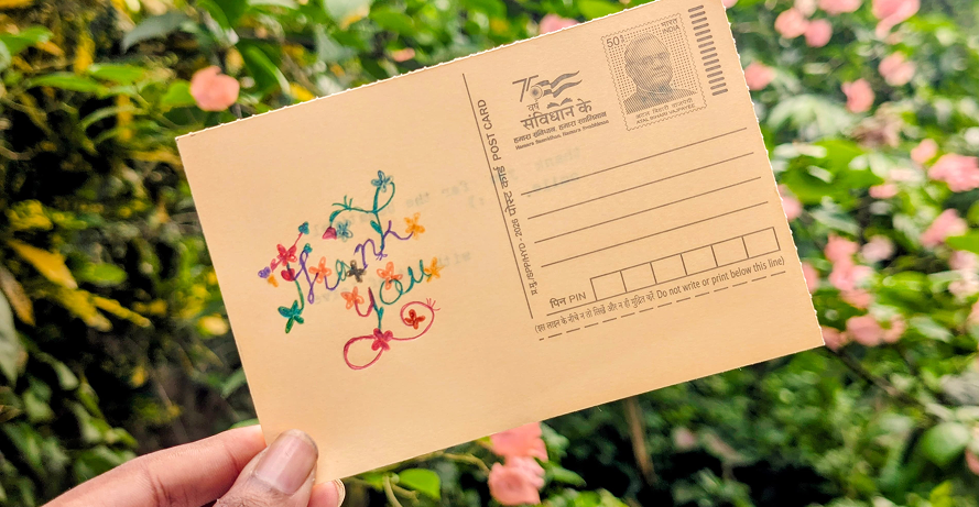
I type postcards on a typewriter. I make some by hand drawn, painted, or covered in little doodles, and send them to people. I love the slowness of it: writing one word at a time, sending it away, waiting, and imagining the happiness when it finally arrives.
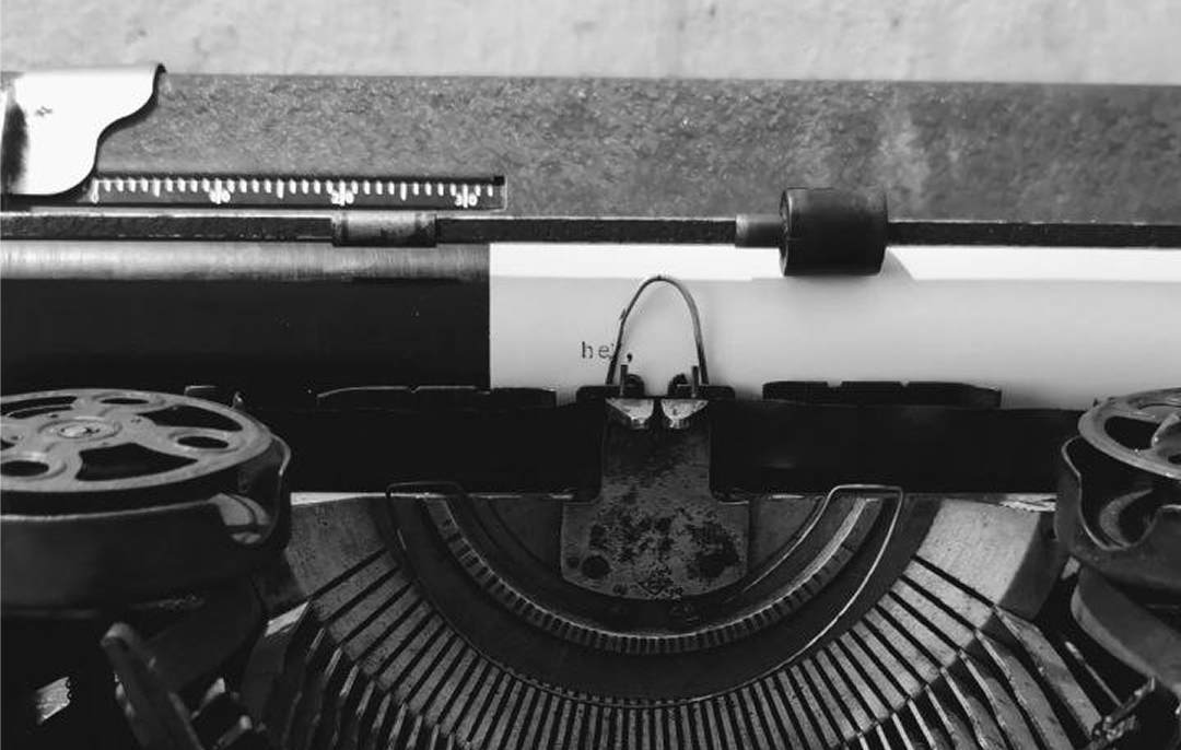
I knew a screen could never recreate ink on paper. I wasn’t trying to replace the real thing.
I simply loved letters too much not to explore what they might feel like in a digital space.
That was the beginning.
This is the first decision I now make with any idea:
Before asking what the product should do, ask what it should make someone feel.
AI is very good at producing the most probable version of a request. If I had started with “build a digital postcard app,” I would probably have received a clean editor, a few templates, a download button, and something that looked like every other online design tool.
It might have worked. It would not have been mine.
Try this with your idea
Before writing features, complete these sentences:
- I keep thinking about...
- I wish there were a way to...
- The part I care about most is...
- I want someone using this to feel...
- I do not want this to become...
You do not need polished answers. You need honest ones.
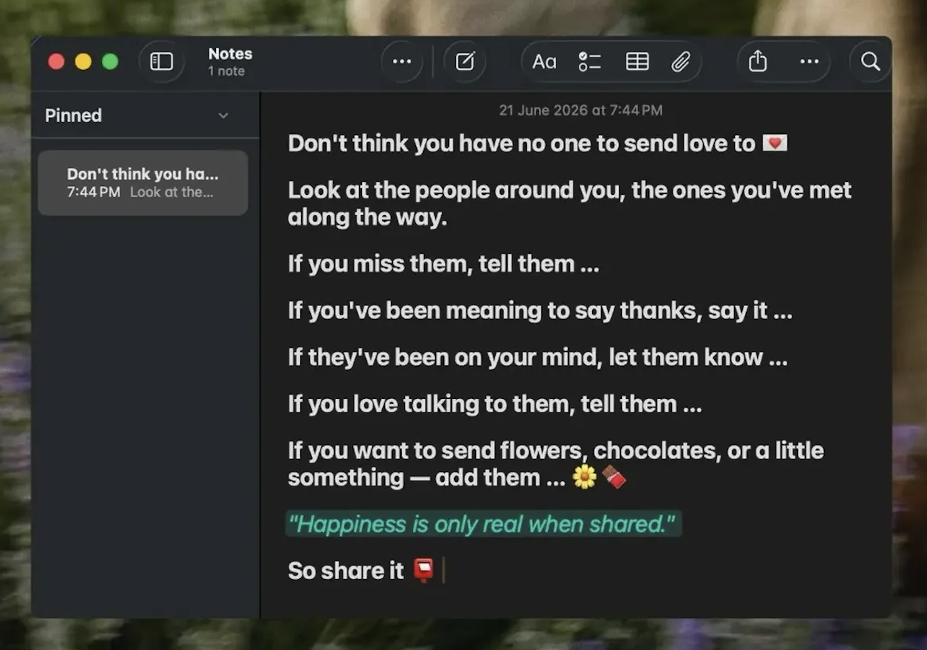
2. Write the story before listing features
My first useful product document was not a requirements file. It was the story I had just told you.
I wrote about why postcards mattered to me: typing each word slowly, making cards by hand, sending something personal to another person, and the happiness of knowing they received it. I also wrote about the tension at the center of the idea—a screen could never feel exactly like ink on paper, but I still wanted to see how much of that care a digital experience could hold.
Then I read it again and looked for product decisions hiding inside it.
The story contained more useful information than a rushed brainstorming session
This is where the idea began turning into a product.
Notice that I still wasn’t deciding exact screens. I was identifying what mattered.
That distinction is important. If you jump directly from an emotion to interface elements, you close the idea too early. “It should feel personal” could influence the writing experience, the visual details, the way a card is shared, or something I hadn’t imagined yet. At this stage, I wanted possibilities, not tickets for an AI coding agent.
Brainstorm in questions
Instead of asking AI to invent the product for me, I wrote questions:
- What makes a digital object feel worth keeping?
- What would make receiving it feel different from opening a normal message?
- How much customization creates care without turning the app into a design tool?
- How should someone send or save the finished postcard?
- What parts of a physical postcard should remain literal, and what parts can become playful?
Questions keep the thinking open. Feature lists make unfinished decisions look final.
AI can help expand possibilities here, but I treat its answers as raw material. I ask for alternatives, opposites, risks, and strange directions. I do not ask it to choose the product for me.
The goal of brainstorming is not to collect the most ideas. It is to discover which ideas belong to the feeling you started with.
3. Scribble until the structure becomes clear
Then I moved to paper.
My early sketches were genuinely bad. I wasn’t really drawing screens; I was arguing with myself in a notebook.
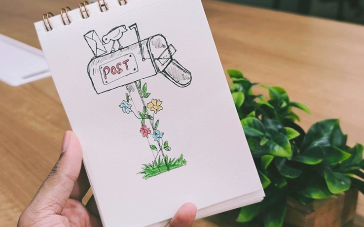
Where does the message go? Does the user design the front first or write first? How does the card turn over? What should be visible before someone opens a received card? What can I remove?
I drew versions quickly, crossed them out, moved pieces around, and wrote questions beside them. Slowly, the scribbles stopped being fragments and became a flow.
That moment is worth waiting for.
Scribbling is where I make structural decisions while they are still cheap. Moving a box on paper takes seconds. Changing the same decision after components, states, animations, and responsive layouts have been built can take hours.
This is also why I don’t begin by asking AI to generate the whole interface. AI makes uncertain ideas look finished too quickly. A polished screen can make you emotionally attached to a weak structure.
Paper has the opposite effect. It gives you permission to be wrong.
What I try to answer on paper
- What is the first thing a person sees?
- What is the one action they should understand immediately?
- What happens before and after that action?
- What information must always remain visible?
- What can wait until later?
- What happens when there is no content, a long message, or a small screen?
- Where might someone hesitate?
I don’t move to Figma when the sketch looks beautiful. I move when I can explain why the main pieces are where they are.
4. Build a visual language from real references
My moodboard wasn’t a Pinterest board filled with unrelated interfaces.
It was the postcards I already owned, the ones I had made and the ones people had sent me.
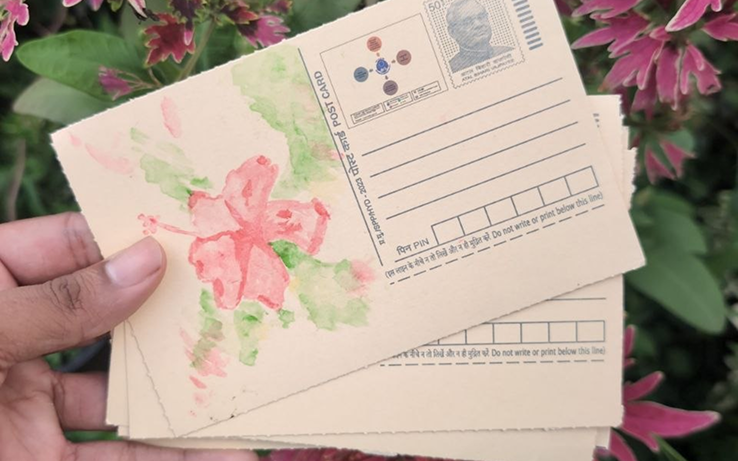
I looked at the off-white color of the card stock, the way ink sits on paper, the amount of space a handwritten message takes, the imperfect edges, stamps, postmarks, and small marks left by the person who made it.
Real objects gave me constraints that a generic “vintage postcard aesthetic” prompt never could.
I turned those observations into a small visual vocabulary:
- Linen — the warm paper background
- Ink — the dark text color
- Sepia — borders, shadows, and aged details
- Postmark — circular marks and date treatments
- Handwritten — personal text, used carefully rather than everywhere
A moodboard becomes useful when it stops being a collection of things you like and starts becoming a set of decisions.
Extract these from your references
- Color roles, not only color values
- Typography roles
- Spacing and density
- Shape language
- Texture and depth
- Motion characteristics
- Details that must remain imperfect
- Things you like visually but that do not belong in this product
The last one matters. Good taste is not only knowing what to include. It is knowing what to leave outside the project.
5. Use Figma to remove ambiguity
From the notebook, I moved into Figma.
At this stage, I was no longer exploring the basic idea. I was making it specific.
I designed the main flow, but I also designed the situations that are easy to ignore:
- A blank postcard
- A very long message
- Different image proportions
- Mobile layouts
- The front and back of the card
- Hover, selected, loading, and disabled states
- What the recipient sees before opening the postcard
This is where Figma changed from a drawing tool into a contract between my intention and the implementation.
If a stranger looking at the design would need to ask me a question, Claude would need the answer too. If I didn’t provide it, AI would quietly make the decision for me.
Sometimes its decision would be reasonable. That made the problem harder to notice. Reasonable is not the same as intentional.
6. Give Claude context before asking for code
Only now did I begin building with Claude.
The first prompt was not “build me a postcard app.” By this point I had a story, a visual language, a flow, a Figma design, and constraints.
I gave Claude the project context:
- What I was building
- Why it should exist
- What the experience should feel like
- The visual tokens and interaction rules
- The current design or screenshot
- The technical setup
- What I wanted it to build first
- What it should not change
Then I built one meaningful piece at a time.
For example, instead of asking for “a font dropdown,” I could explain the intention: choosing handwriting should feel like picking up a pen. That gives AI room to help with the interaction without losing the reason behind it.
I try to prompt at three levels:
- Context: What are we building, and for whom?
- Intent: What should this part help someone do or feel?
- Constraints: What must remain true while implementing it?
The task comes after those three.
A simple prompt structure
Context:
This is a digital postcard experience designed to feel personal and worth keeping.
Intent:
Choosing a writing style should feel like choosing a pen, not configuring software.
Constraints:
- Preserve the existing postcard dimensions
- Use the current design tokens
- Work on mobile and desktop
- Do not change the sharing flow
Task:Implement the handwriting selector shown in the attached design.
The exact wording is not magic. The structure is useful because it stops the task from becoming detached from the product.
7. Build through small visual feedback loops
AI rarely produced the final version in one attempt.
The real workflow looked more like this:
- Build one part
- Run it
- Open it on a real screen
- Compare it with the design and the original intention
- Capture what is wrong
- Ask for one focused correction
- Repeat
This loop is where most of the quality came from.
Stop describing visual bugs. Paste the screenshot:
For a long time, I tried to describe every visual problem in words:
The stamp’s white border looks too thick on mobile, and the message is crowding the bottom edge.
That sounds clear, but it forces Claude to reconstruct a visual problem from my description.
Now I paste a screenshot and add one sentence of context.
When I described the issue, I received a fix for the problem I managed to articulate. When I shared the screenshot, Claude could respond to the problem actually visible on the screen—including details I hadn’t consciously noticed.
Screenshots are especially useful for:
- Spacing and alignment
- Incorrect proportions
- Responsive layout problems
- Overflow and clipping
- Visual hierarchy
- Differences between the design and implementation
I also test the output on a real phone. A narrow desktop browser is not the same thing. Touch targets, browser chrome, font rendering, viewport height, and the way you physically hold the screen can reveal different problems.
8. Ship the product, not just the code
Many “built with AI” stories end when the project works locally.
But an idea has not become a product until somebody who isn’t you can open it and use it.
I deployed the postcard maker and gave it a proper home at postcard.ishamsu.com. Taking an idea all the way to a shipped product is the same work we do in product development at Crescentic
Before sharing it, I used a simple launch checklist:
- Deploy it somewhere reliable
- Connect a clear custom domain or subdomain
- Add analytics before the first visitors arrive
- Add a useful page title and description
- Create a proper social-sharing image and metadata
- Add a favicon
- Test every main flow on a real phone
- Open the shared link inside the apps where people will actually receive it
- Check empty, long-content, loading, and error states
These tasks are not glamorous, but they change how the work feels. A broken link preview, blank browser icon, or unusable mobile screen tells people the product is unfinished before they experience the idea.
Shipping properly also creates a new source of information: real behavior.
Analytics can tell you where people hesitate or leave. It cannot tell you what every person feels, but it can show you where to look. The people who become confused and close the tab usually won’t send a bug report.
Building gets the idea out of your head. Shipping lets reality answer back.
9. Let real people challenge your assumptions
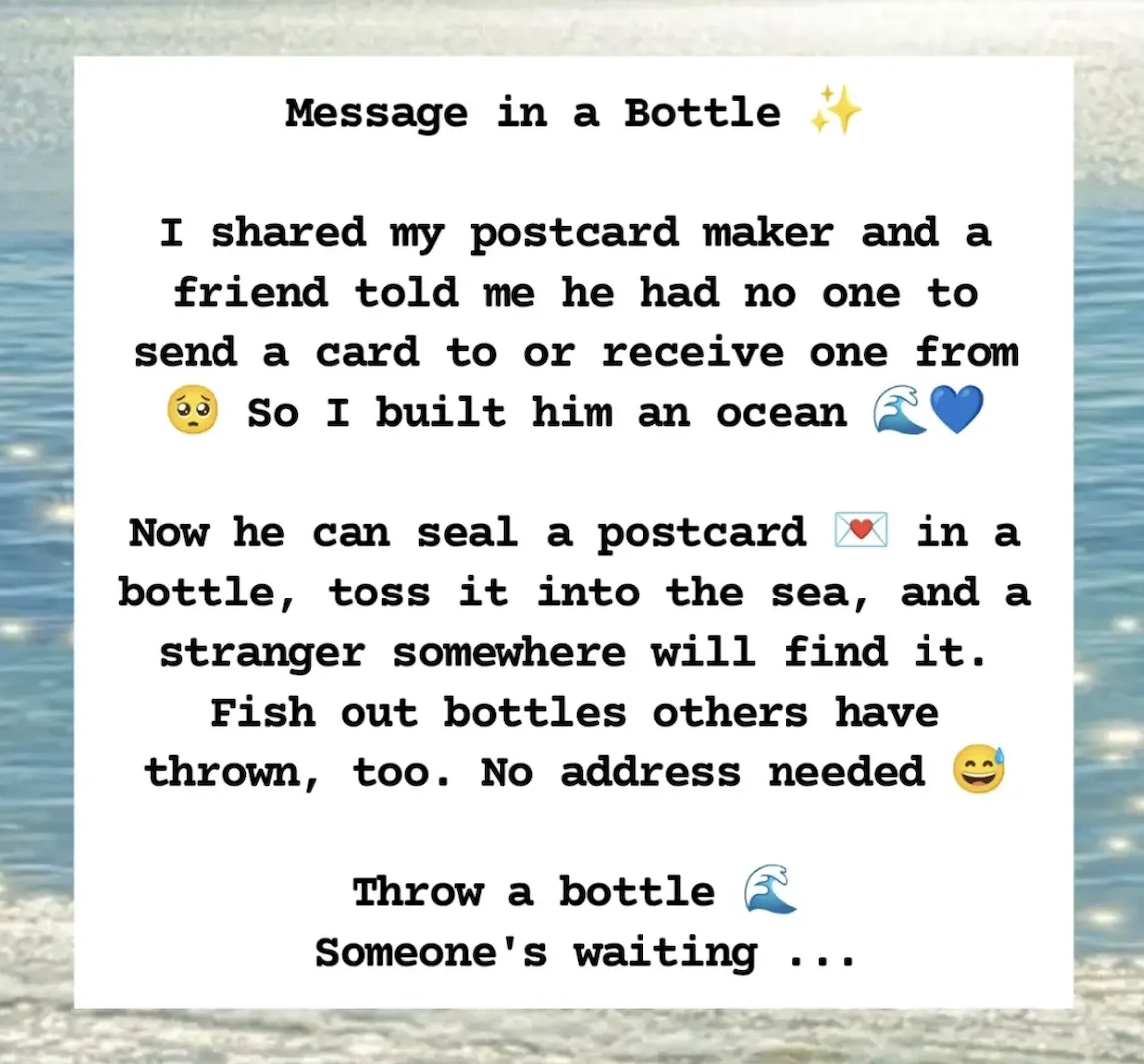
After I shared the postcard maker, a friend told me he had nobody to send a card to—and nobody who would send one to him.
That stayed with me.
I had designed the product around my own experience: a box of letters on my desk, people I write to, and the happiness of receiving something back. I had quietly assumed everyone entering the app already had a recipient.
There was no broken button to fix. It wasn’t a normal feature request. It was a human truth that exposed an assumption underneath the whole product.
So I built him an ocean.
You can seal a postcard inside a bottle and throw it into the sea. A stranger can find it. You can also fish out bottles that other people have sent. No address is needed.
That feature did not come from brainstorming harder with AI. It came from listening to somebody whose life did not fit the product I had imagined.
This changed how I think about feedback.
Feedback is not only a list of requested changes. Sometimes it is a story, a hesitation, an unexpected use, or a sentence that reveals the limits of your original idea.
People also began using the app to send postcards to me. I built the tool, shared it, and then postcards made inside it started arriving—from friends and people I barely knew.
That completed the loop in a way I could never have designed alone.
What your role becomes when AI writes the code
Using AI did not remove the work. It changed where the work happened.
AI made implementation faster. It did not make taste, clarity, or care automatic.
What comes next
The postcard maker is live, but the idea is still growing.
The part I cannot stop thinking about is what a website cannot yet recreate: the journey.
When I sent my first physical postcard, I kept wondering where it was. Had it arrived? Was it sitting in a post office? Would it travel by van, train, or flight? I called the person to ask whether they had received it, and then both of us began waiting for the same piece of paper.
Before sending it, I also had to find their address. I searched through food-delivery apps because they knew where my friends lived, while I did not have a real address book of my own.
Then came the ritual I loved: writing the card, walking into town, finding the red postbox, and dropping it inside. After that, it was out of my hands.
Those moments are shaping the next version: a virtual address book, a post office, a collection box, a postman, sorting, cargo, trains, flights, and a journey you can watch. Days later, the recipient’s phone will buzz and the postcard will arrive.
Slow, on purpose.
There is some irony in using the fastest building tool I have ever had to create something whose entire point is waiting.
But that may be the thesis of the whole project:
The speed is not the product. It simply helps you reach the version worth waiting for.
Try it: postcard.ishamsu.com — write a postcard to someone you love, to yourself, or simply to hold onto a memory. Save it, share the link, or throw it into the ocean and let a stranger find it.
.webp)